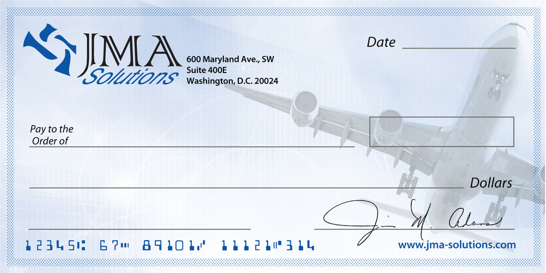
Adding a background logo or art in a subdued transparency can add to the effectiveness of your sign, or in this case a dry erase presentation check. Mortgage bankers like to put houses in the background and most groups like to put logos. What would make your graphic show more pop?


